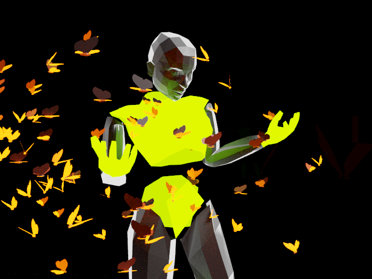
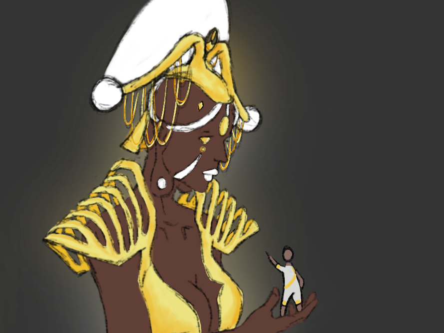
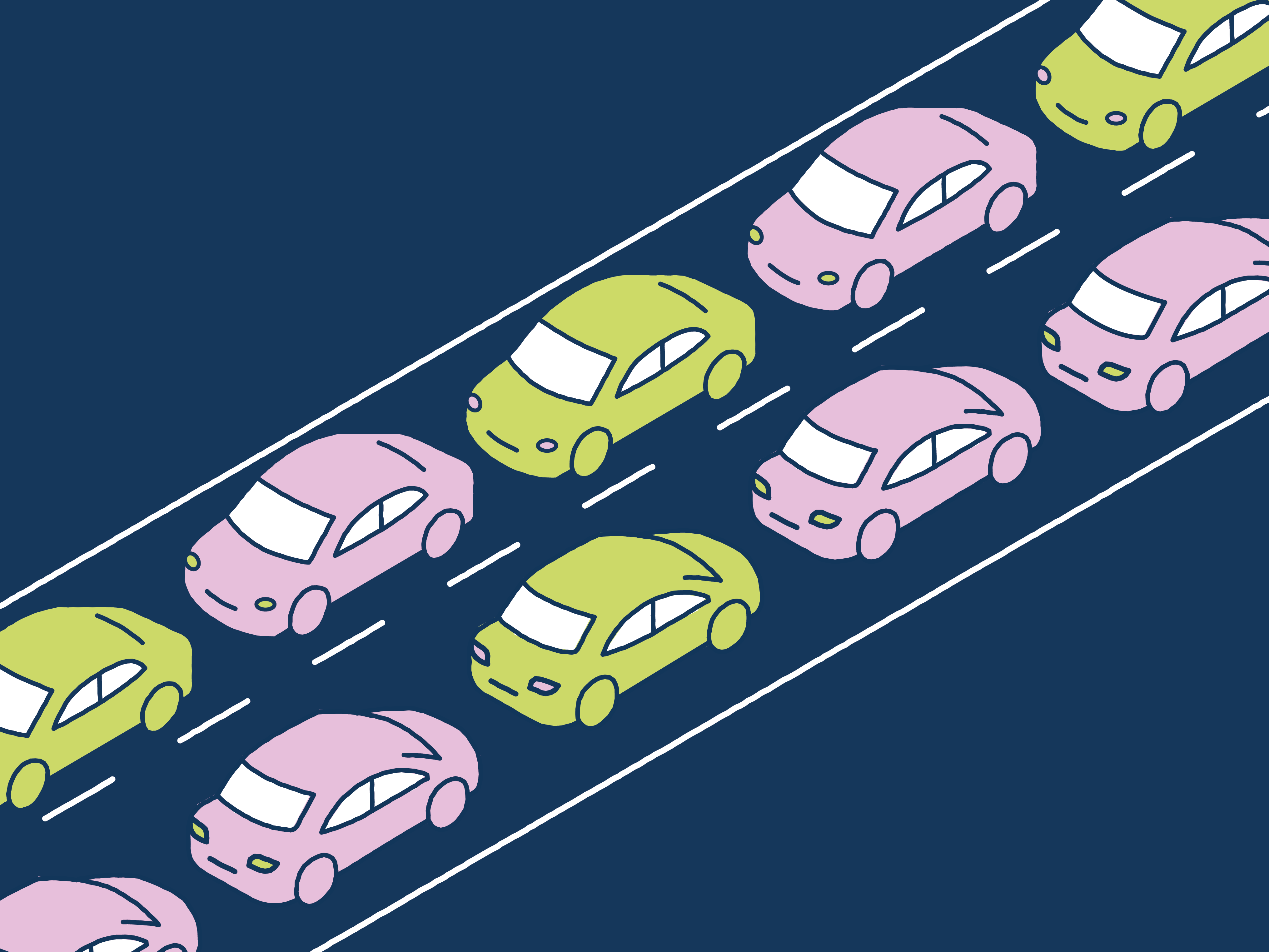
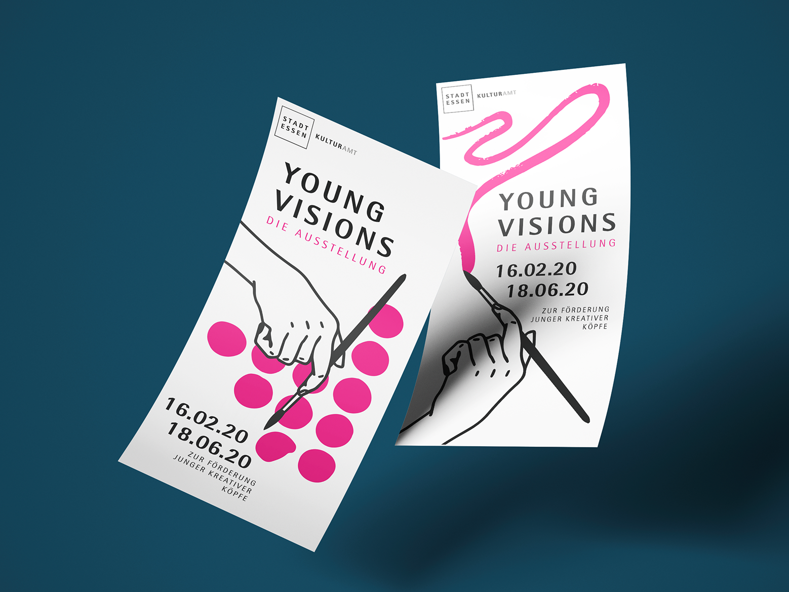
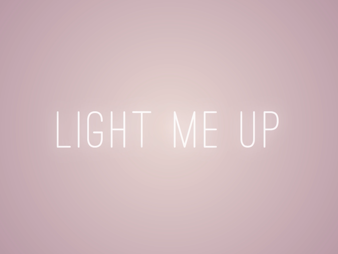
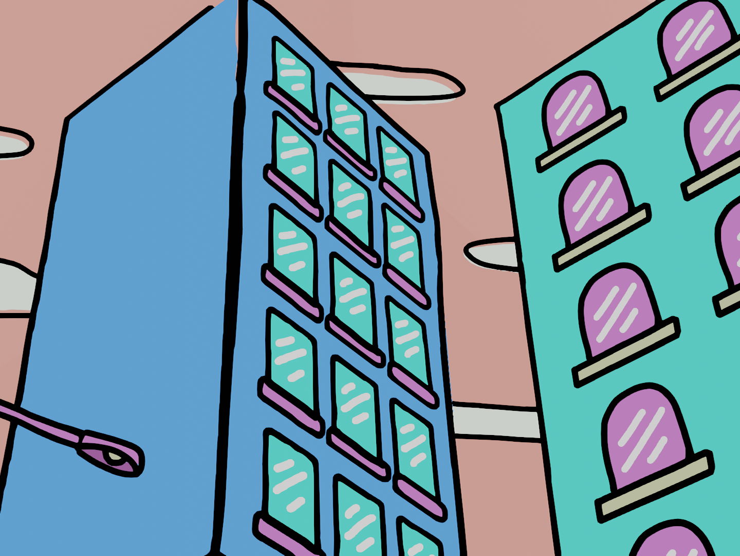
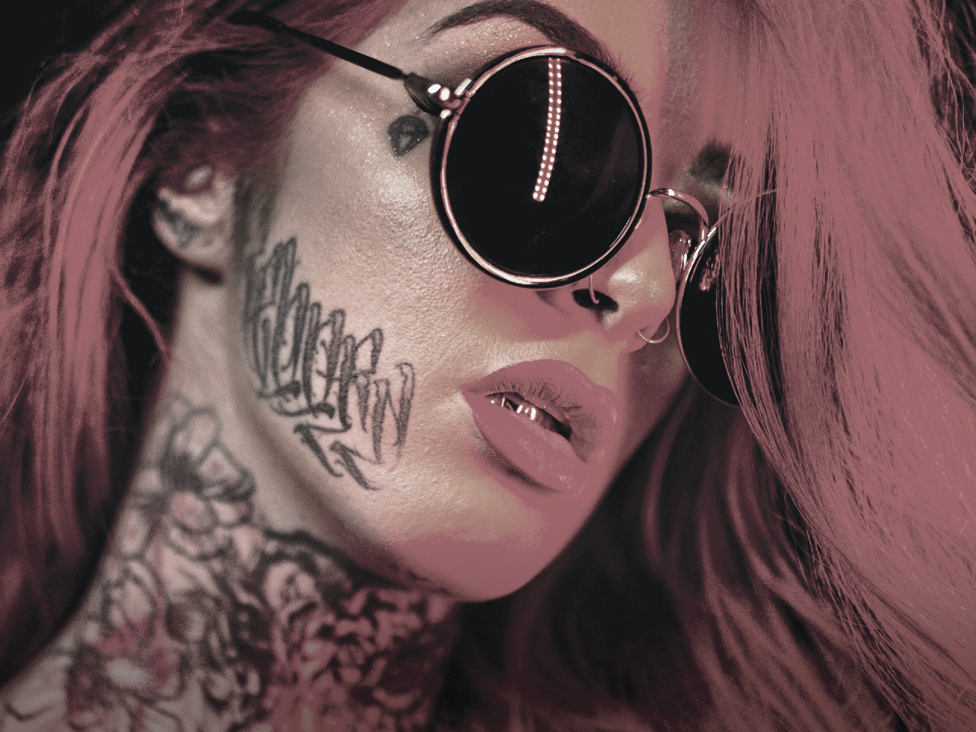
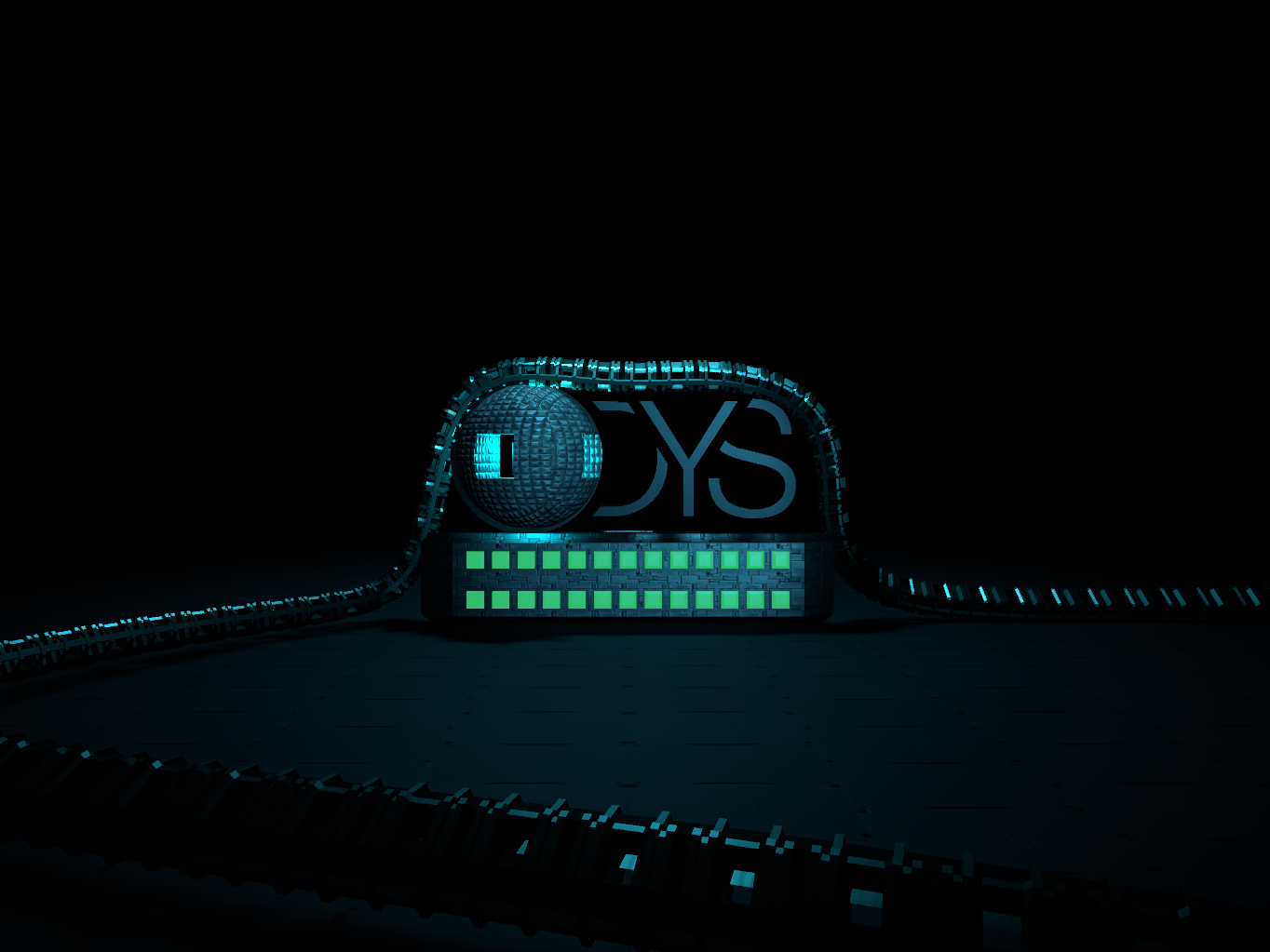
Creating this explainer video I was encouragedto try out as many different styles as I could before getting started with the actual animation. Below you can see some insights into the progress.
The styleframes above show my first draft. In the end I actually decided to use this design for the video, because - despite going through all these weeks of designprocess - I still liked it best.
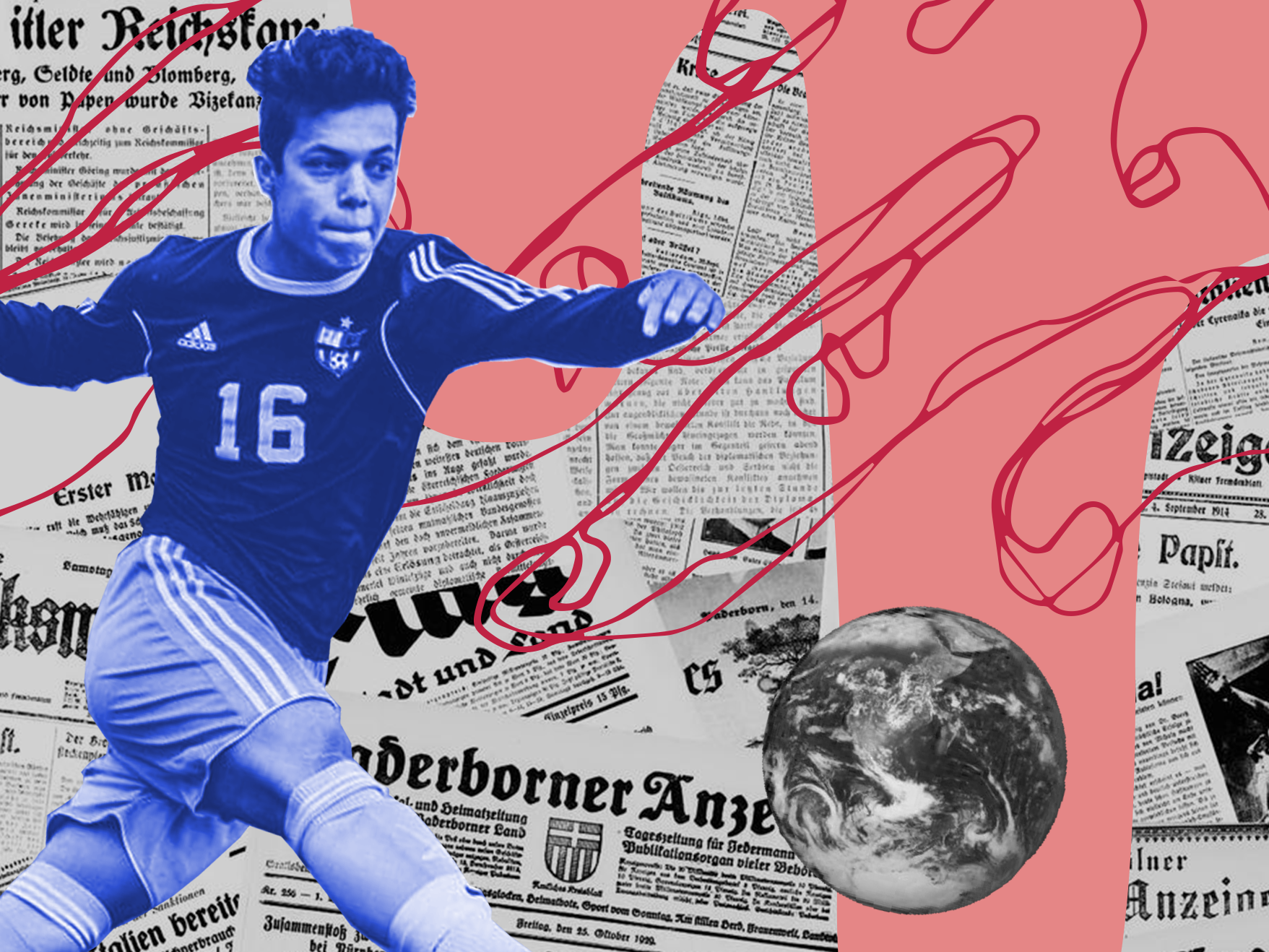
This was my second favourite draft. I am really into surrealistic designs and using photos as patterns ignoring correct lighting or perspective. The collage style always was and still is something I wanna use more often in the future.
Creating these styleframes I tried to include some typography on all three axes to build up plasticity. In the end it did not work out that well, so I discarded the draft.
This time I actually used some 3D models with a dough-like surface to create a more humorous atmosphere, supported by some ironic comments.
