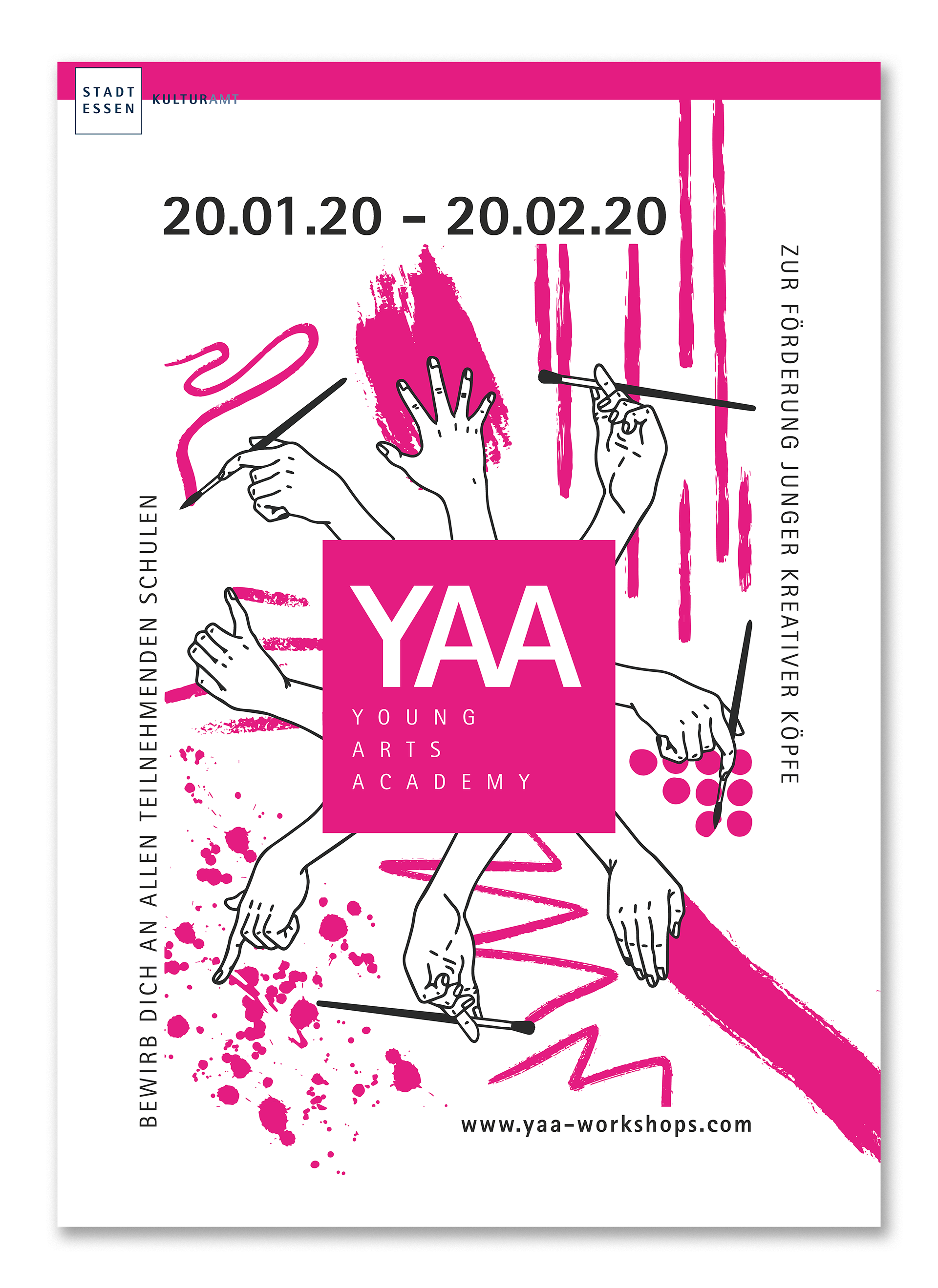
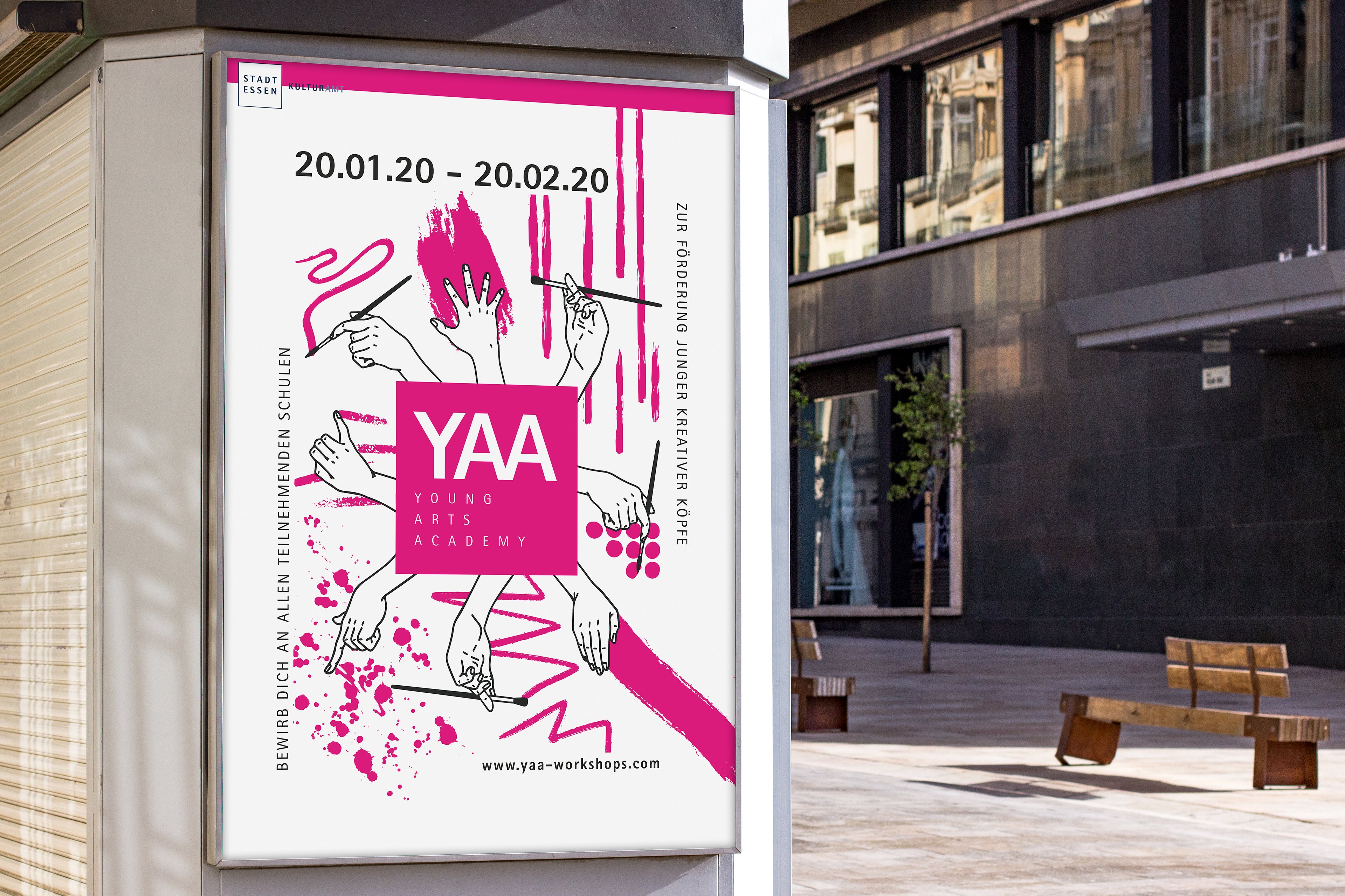
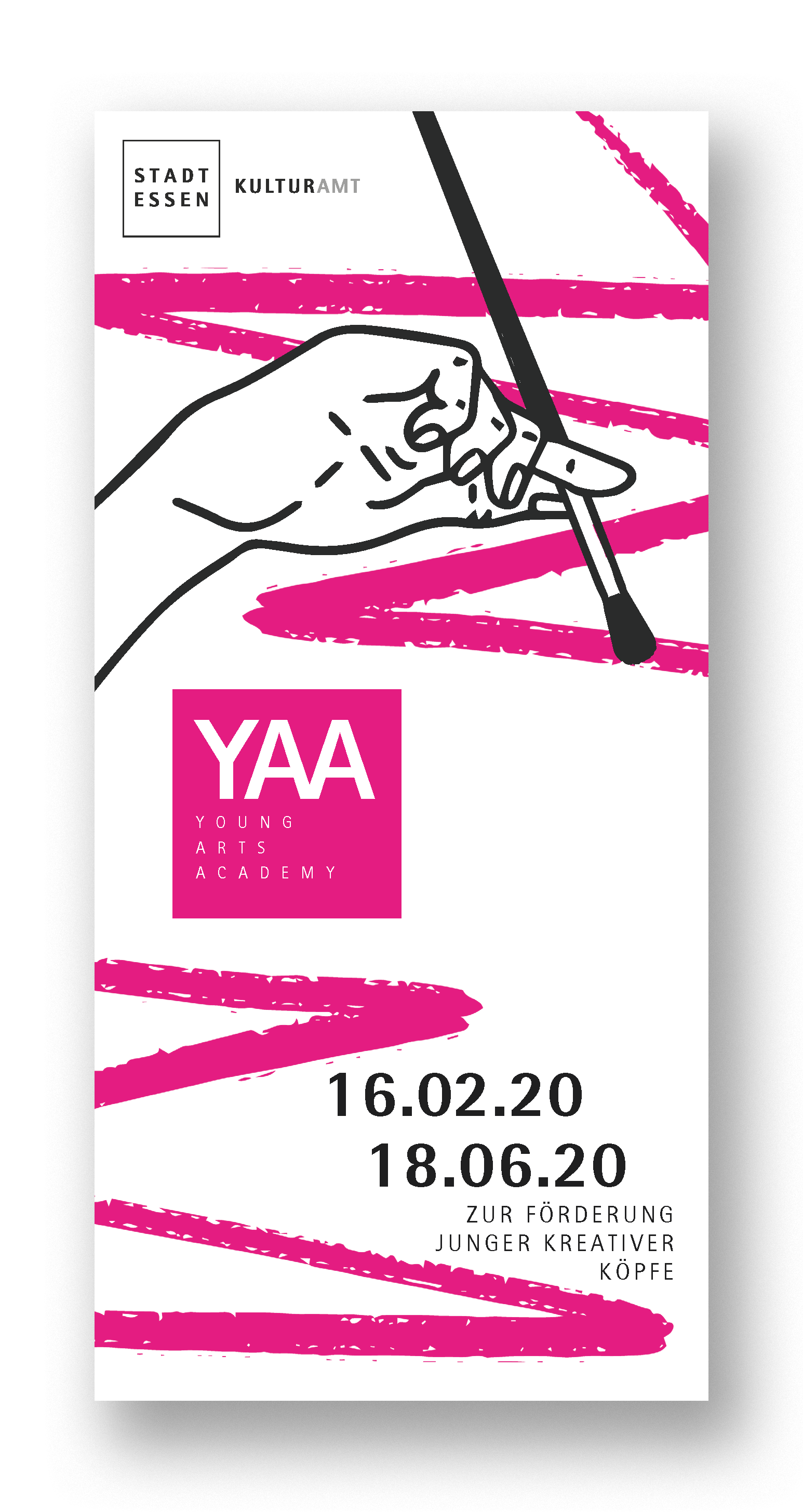
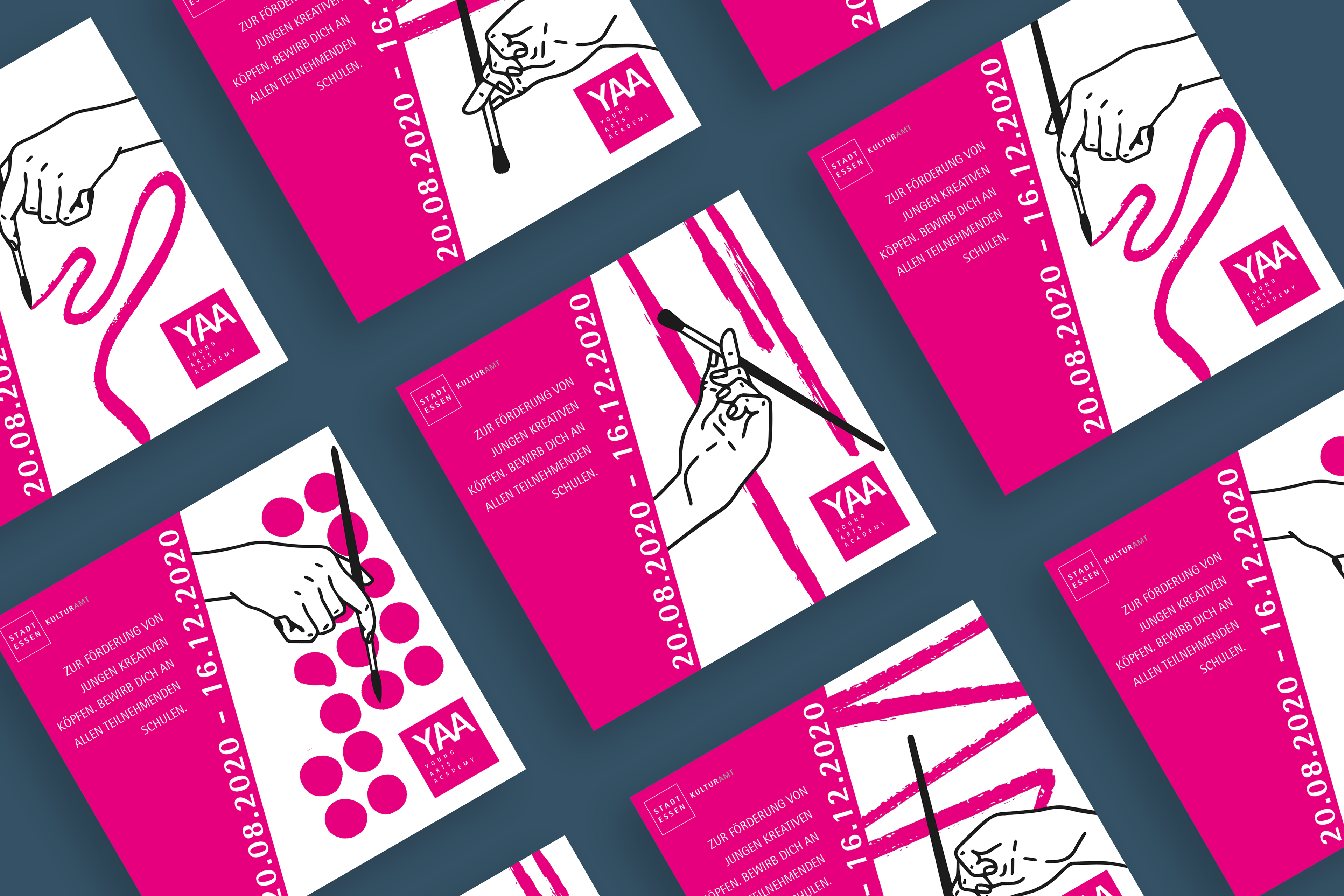
First of all I created this poster. I thought of the hands as a good representative for the young people, because hands are the ultimate tool of art and also anonymous. That way the youth could identify themselves with the visual. The design is pretty wild and needs a second look to get the information needed, representing the character of creativity itself. I only used the colors of black, white and a magenta tone from the citys manual to keep the draft clean.
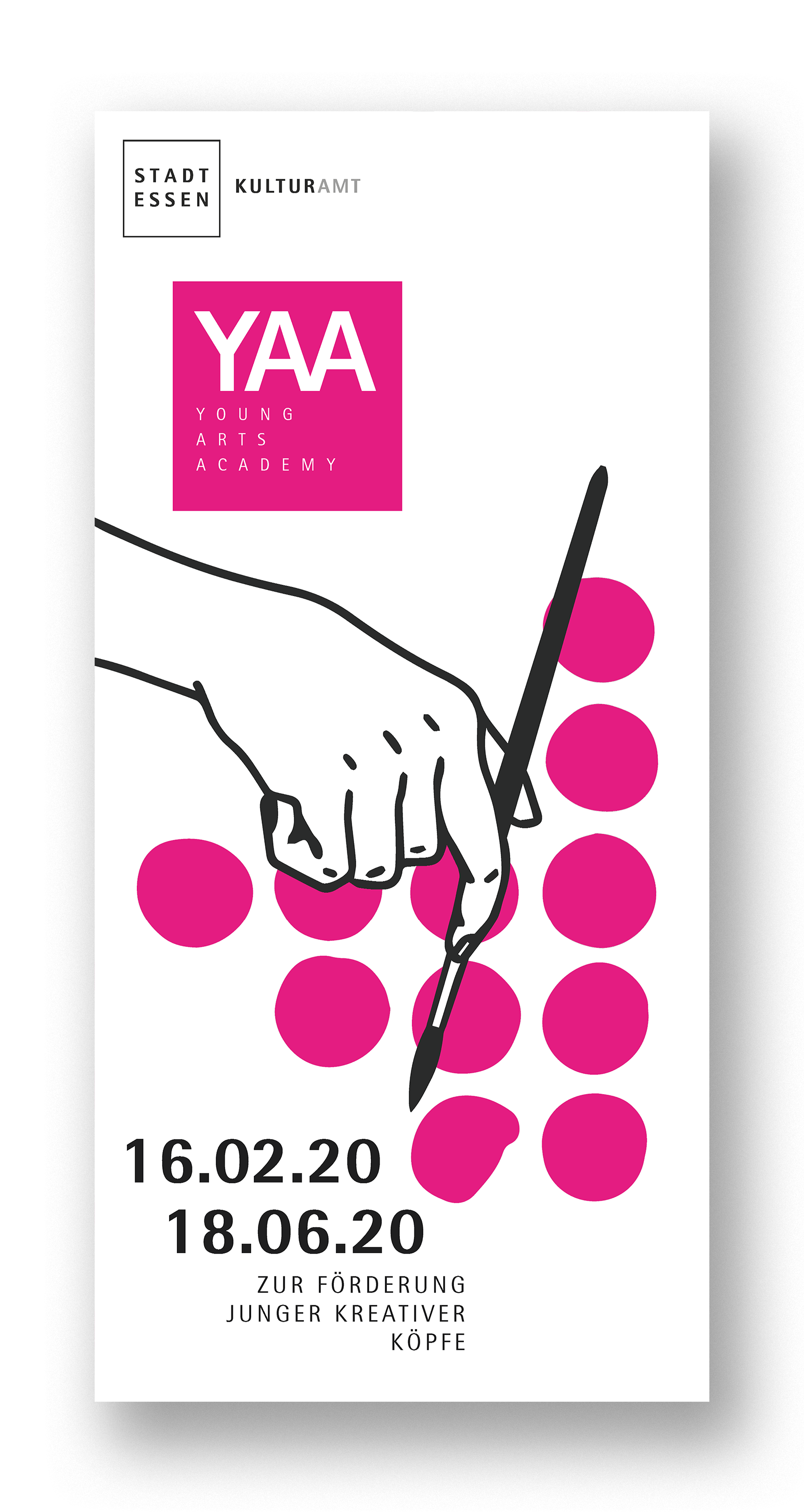

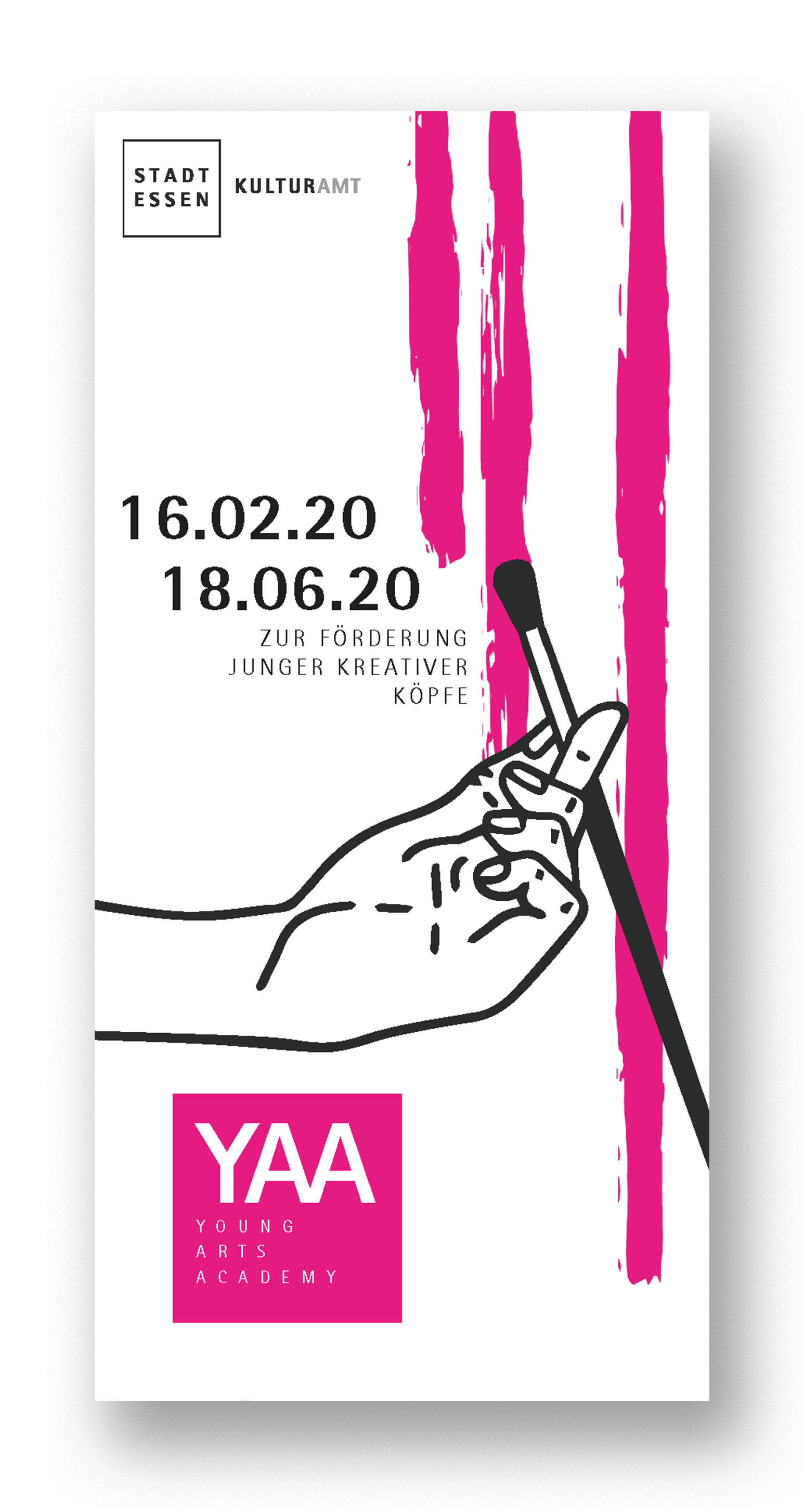
For the flyers I took some of the hands as key visuals to create four different layouts. Because of the colors and the reference to the main poster it all becomes one design with different, interesting appearances, while remaining recognizable.
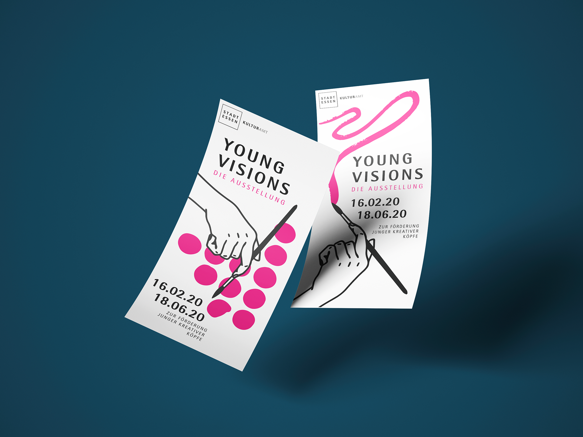
Based on the idea of the flyers I designed four different examples for posts on social media. The important information is a bit mor present, because of the magenta background, creating a strong contrast to the key visual on the right. By taking the same visuals, the posts clearly referr to the main Corporate Identity.
Although "Handmade" couldn´t convince the committee in the end, it was fun and a great way to experience working with big authorities and developing ideas during a longer process.