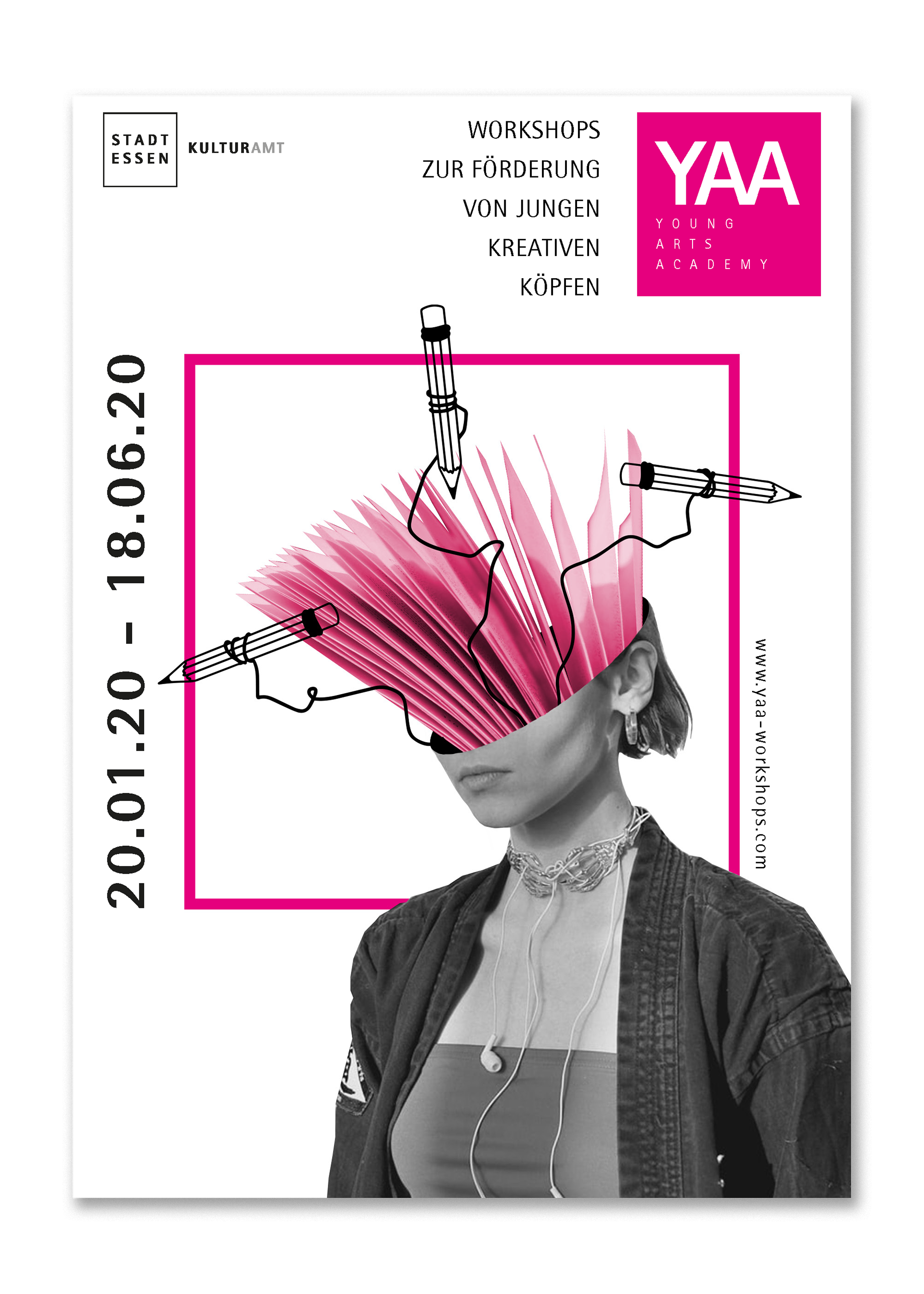
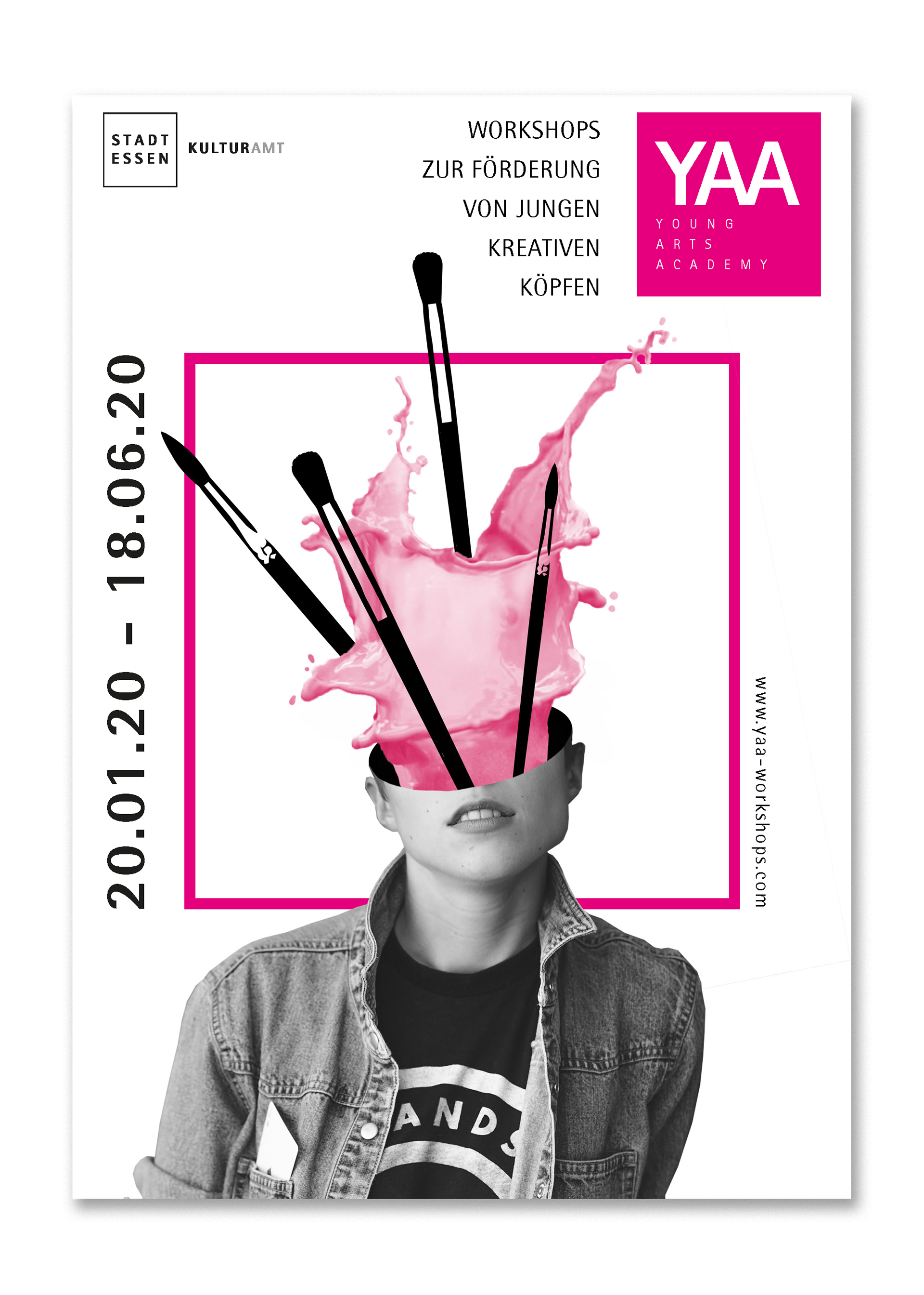
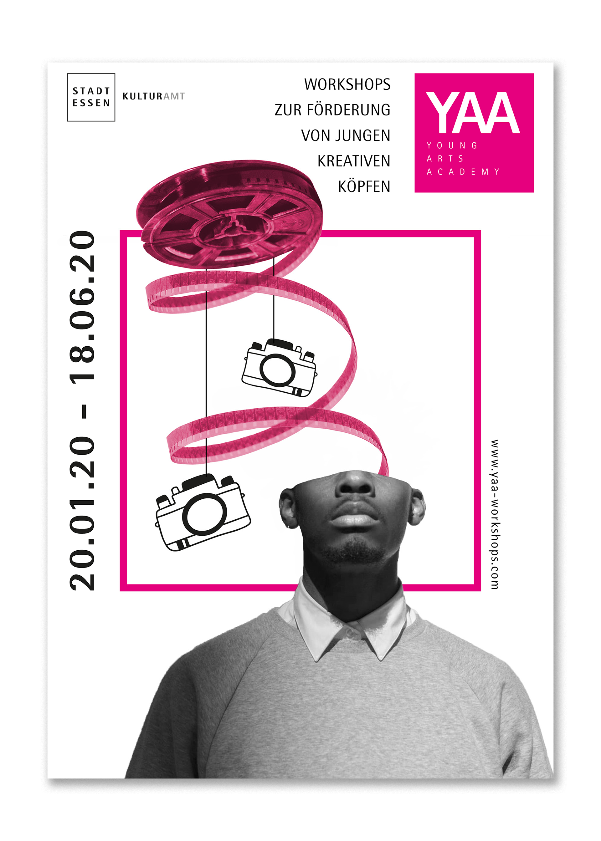
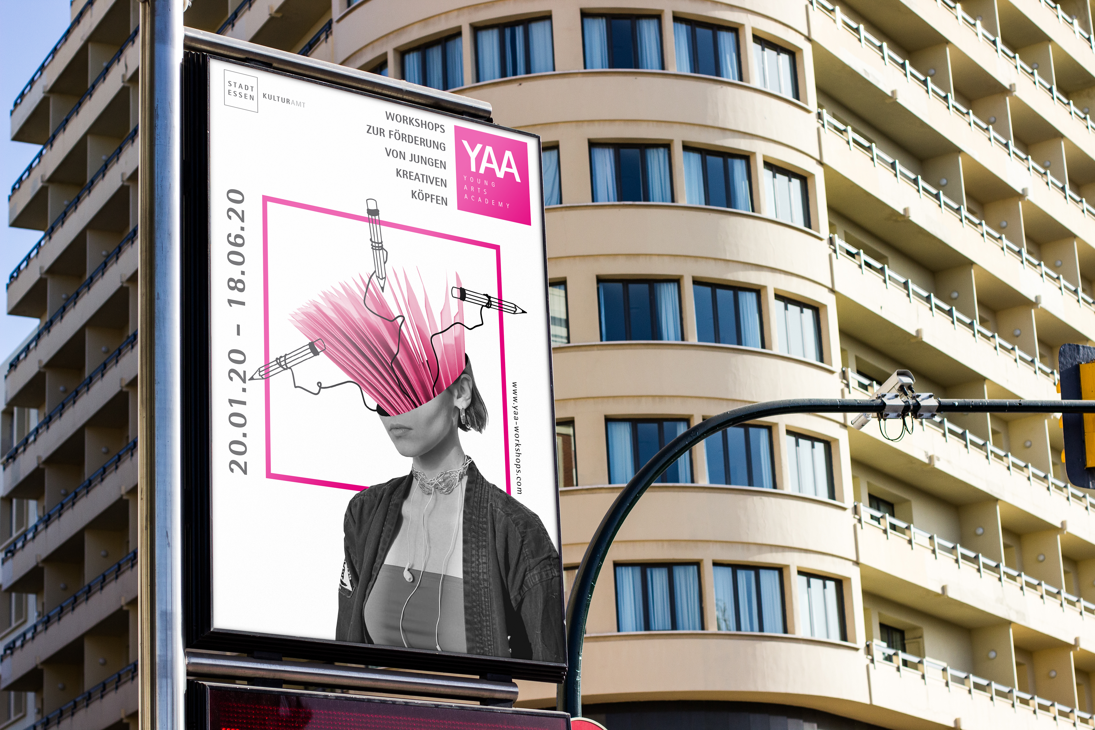
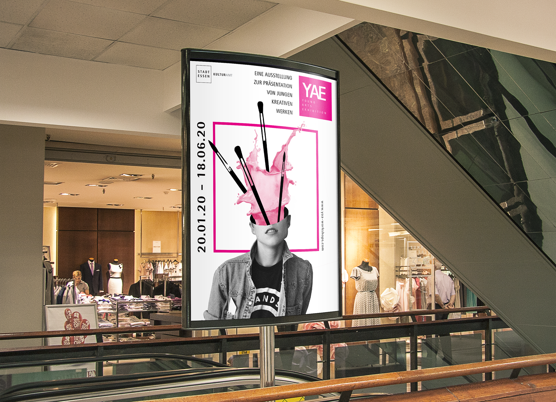
According to the different kinds of art, which can be learned by taking part at the workshops I created three posters for photography, painting and drawing. The main idea was to visualize the process of creativity by letting the art supplies exlode out of the young peoples minds. To create a visual, teenagers could also identify themselves with I used photos of actual teens, but kept them anonymous by removing their upper faces.
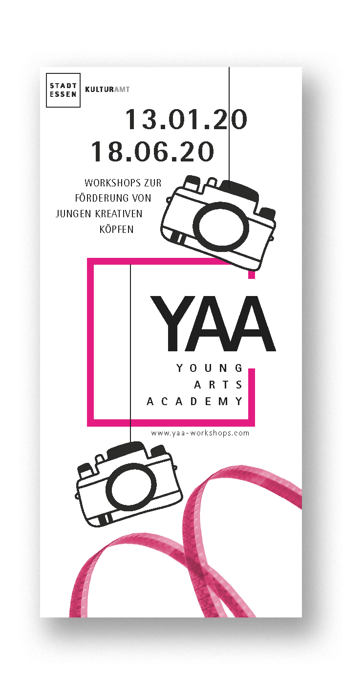
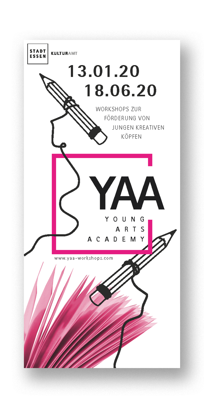
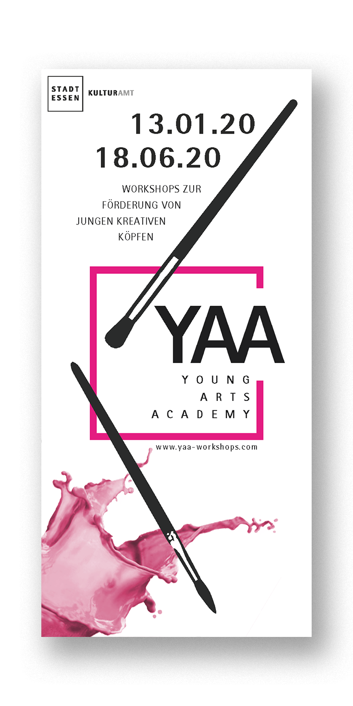
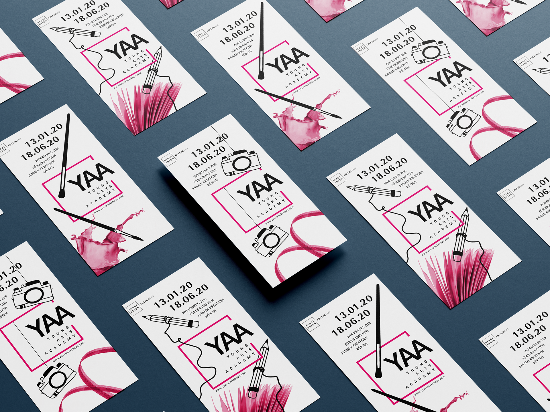
For the flyers I took the art supplies and created the layout around them, so the viewer can easily understand what the programm is about while still reffering to the main key visuals.
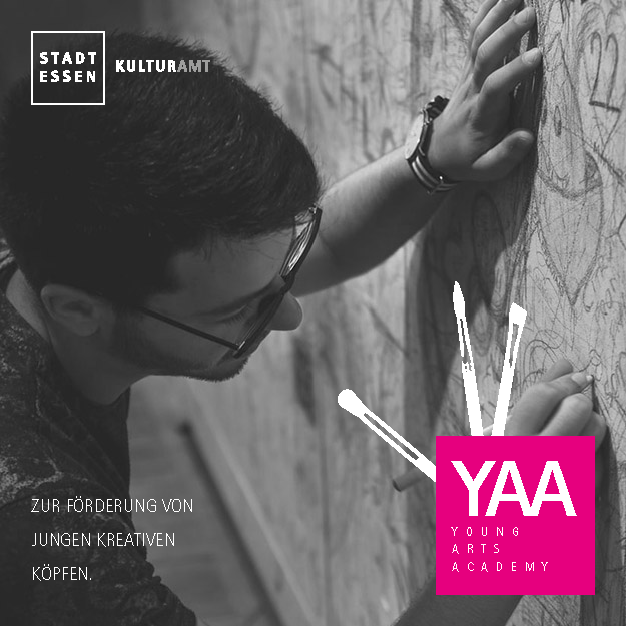
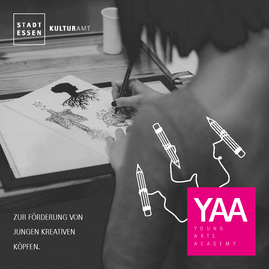
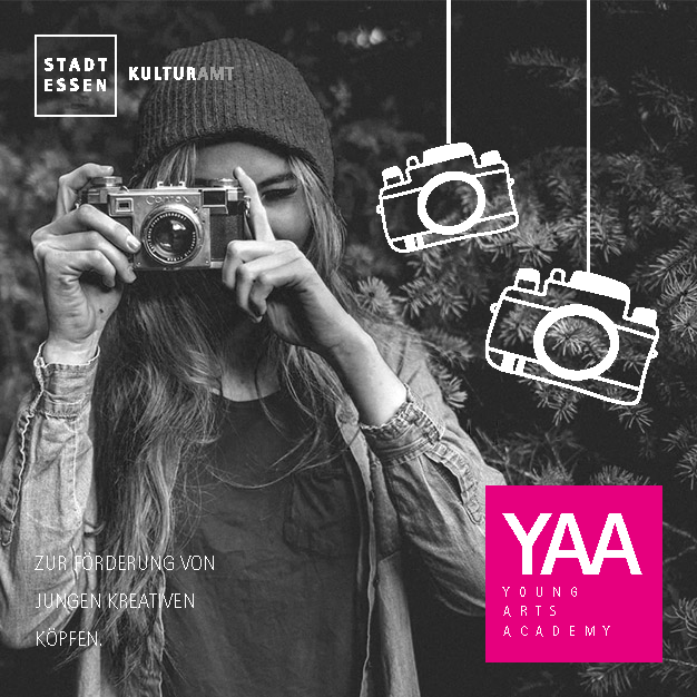
The social media posts contain a photo as the main visual in combination with the art supplies to referr to the main Corporate Identity. The idea was to make the social media posts variable by using photos, which could be easily replaced by actual footage captured during the workshops later. The whole draft just uses black and white, even in the photos to keep the strong magenta tone from the cities corporate manual as a recognizable eyecatcher.
I can proudly say that "Out of Mind" could convince the cities committee and won the competition.